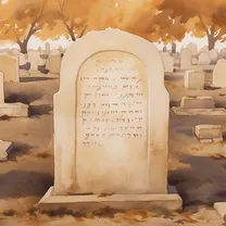
This is a short one, most of it is already on the title. Around 2022 I was approached to make a website for an abandoned jewish cemetery in Sidon Lebanon, as part of a revitalization project to preserve its history and document its once vibrant community. Having done exactly 01 static website in my life I originally declined as I felt I wasn’t up to the task but the website they had was such a broken wordpress mess that I decided to give it a shot.
The stack
I decided to try out Astro, the new cool web framework and was happily surprised with it (so much so that I made this website with it as well). With that out of the way, there wasn’t much to decide sicne Astro is so powerful. My first website had vanilla js, vanilla css and vanilla html, so i felt like it was time to step up from the basics and try some new toys. For css I picked tailwind as its design philosofy resonated a lot with me and decided to stick to vanilla js as much as possible. Since I’m not a front-end developer, I wanted to minimize the time I wasted learning a new technology that would have become completely obsolete by the time I needed to use it again. Besides, I probably wouldn’t have picked a safe bet like react and would have chosen a new shiny toy like svelte.
As a package manager, I tried quite a few. I started with npm, tried pnpm and ended with the at the time recently released 1.0 bun (which has come back to the news since it was aquired by Anthropic). Bun had an interesting proposition but for my use case was honestly overkill. Besides, I had quite a few issues with it dealing with Sharp for image optimization and some corener cases that hadn’t been sanded out yet due to being so new. I may go back to it in the future, but for know I don’t see much reason to go away from pnpm.
For hosting I went with a free public github repository (I was a bit afraid of passing the 1 Gb size limit with all my images but everything ended being ok) and connected it into Cloudflare to get some DDoS protection and basic analytics (as well as the domain name).
Mapping a cemetery at the other side of the word
While I was reviewing the website material, I had a cool idea. What if we took the hundreds of tomb pictures and made an interactive map where a user can explore the cemitery virtually? It had clear sections with tombs from different times and families tended to be clustered together, I felt like presenting it as a simple spreadsheet wouldn’t do it justice. So I began my work on what I thought would be a fun side project for the weekend.
The thing is, this cemetery is in Lebanon, and I am on Brazil. I couldn’t take a bus and go map everything myself so I was really limited in what resources I had. I tried to get sattelite images but there was no free images with the necessary resolution and I wasn’t really comfortable with hiring a drone/sattelite to take pictures of a frontier region with, at the time, a complicated geopolitical situation. Eventually I found an old CAD map of the cemitery, it was burried in the website files in a dusty hard-drive I had been neglecting. However, it wasn’t really a CAD file, it was a jpeg of a printscreen of what once, I think, was a CAD file. Sadly, the author1 of this map had passed away so there was no way of recovering the original, that screenshot was everything I had to work with.
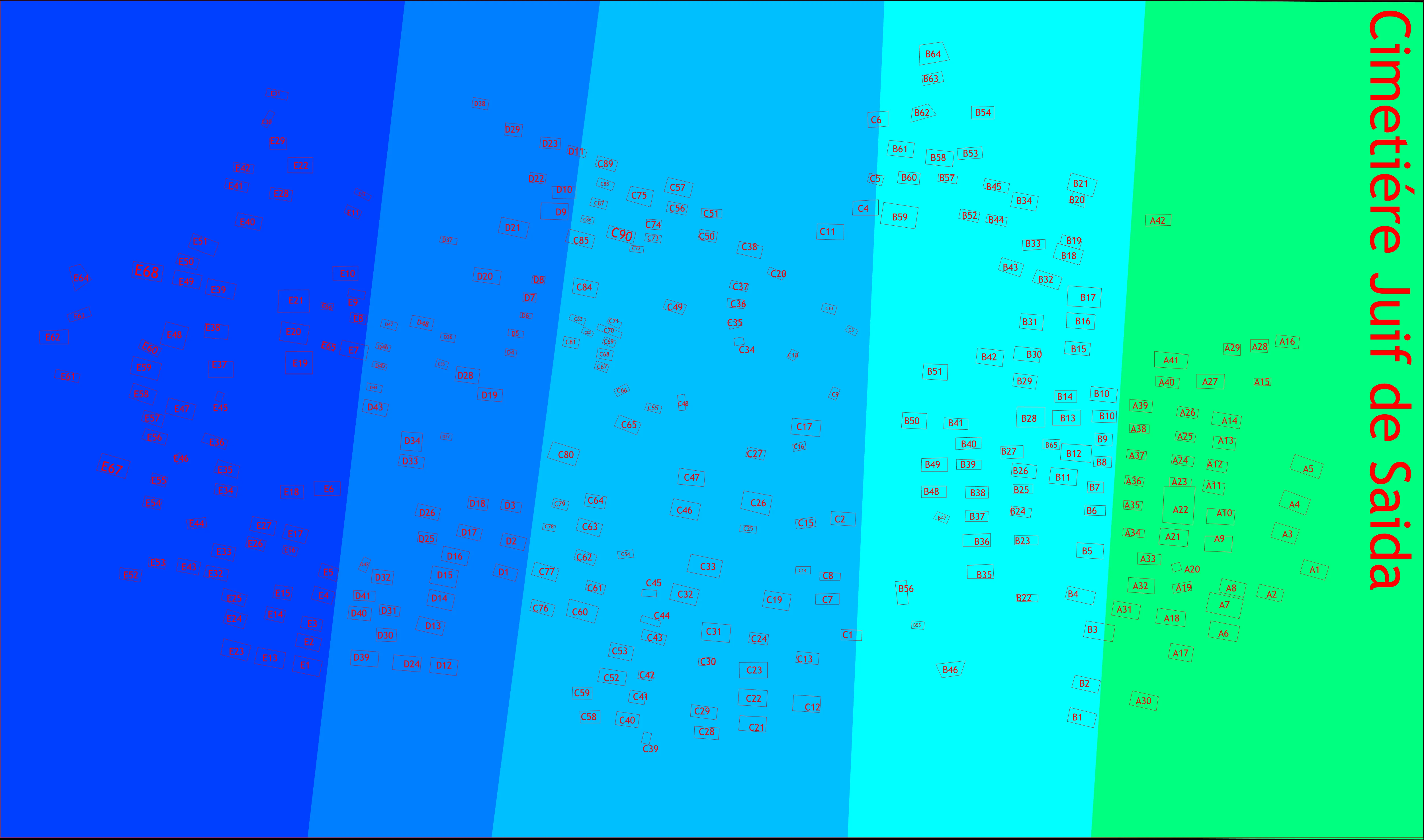
I began the extremelly slow and annoying process of converting the screenshot into an usable SVG. Inkscape has some auto-tracing features that helped but we are talking about hundred of tombs that needed to gain an individual id to be targeted by the js library that would than create the pop-up caroussel with the tomb images. I managed to create some macros and stream line a bit the process but it was still very slow and annoying.
Once everything was done I realized that my svg was horrible because the auto tracing made all the rectangles that repsented the tombs into rings with at the very least double the amount of nodes needed. So, once again I started remaking the svg for the second time, remaking the tombs into simpler geometric objects. I wrote a buggy script that automated a big part of the work but it still took at least an hour of tedious work. Then I realized my work had a small impact on the file size since the text in the svg was also a mess of nodes making the image too big and lagging the whole website, so I recreated everything in inkscape and than converted the text to paths.
Great, everything done, right? No, because I’m an idiot that made everything worse by converting from text to paths, storing text as text is A LOT more efficient than converting everything to paths with a ton of nodes. And turns out that in my infinite wisdom I had overwritten the original and had to recreate everything from scratch for the fourth time. Fantastic. Eventually everything worked out and the map became really compact and responsive, but I had to take some time off from working on this project and quell my new found hate towards SVGs.
Click here to look at the final version! ↗
Internationalization (i18n) and right to left languages
An interesting challenge was the i18n of the website, I had never written a multi-lingual website and at the time astro didn’t have support for it so I had to learn a lot to make things work. The most interesting part must be adding arab support, I had to re-write most of my css since its right to left nature broke a lot of stuff (including my map ↗). Once I learned there are css properties for start and end instead of left and right, things went smoothly (I’m not a front-end dev, I give myself a pass for not knowing this one).
Sadly, I never got the finished arab translation, so for now the uncomplete arab version is not deployed.
I dont know how to end this post, so here is a weird commit.

Footnotes
-
Shout out to Nagi for everything he has done for this project, wish I could have met him. ↩